Test Your Mobile Designs Across Screen-Sizes: The Responsive Design Test Bookmarklet
See on Scoop.it – Enterprise Social Media
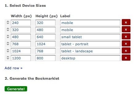
Robin Good: “This simple bookmarklet allows you to you view any webpage in multiple screen sizes, simulating the screen display size of different devices.”
Free to use.
Try it now: http://www.benjaminkeen.com/misc/bricss/ ;
See on www.benjaminkeen.com